I tried analyzing it with the free heat map analysis tool "User Heat"

table of contents
This is Ohara from the technical sales department.
This time, I will write about my impressions after conducting a "heat map analysis" of my company's corporate website.
What is a heat map analysis tool?
on website pages
such as ``Which page text is most read?'' and ``Which parts of the page are often clicked?''
Based on that data, we review the website structure and information.
This is a tool that helps increase traffic on your website and improve conversions.
Google Analytics is another website analysis tool, but
Google Analytics
analyzes data by quantifying it based on information such as page access and referrers.
Heat map analysis
visualizes "click points on the page, mouse movements, viewing locations, and exit areas."
This provides a guideline for improving the website's usability and site structure.
Try using the heat map analysis tool "User Heat"
I will analyze the heat map using
"User Heat", which seems easy to use With "User Heat", you can use the basic analysis functions for free, but there is a limit of 300,000 PV per month.
After creating an account, go to the URL below to issue an analysis tag, and
paste it on the page you want to analyze the heatmap.
http://userheat.com/groups
For WordPress, there are detailed settings below.
http://userheat.com/guides/installation_wp
Tagging is not required for WordPress.
Heat map analysis will start
by simply setting the "ID issue/input" issued by User Heat in the "WordPress plugin" However, after completing the settings, User Heat will read and reflect the site information.
It will take some time before it can be analyzed.
(It took 24 hours to be able to properly analyze the heat map.)
Try heatmap analysis of your website
This time, we performed a heat map analysis of our company's corporate site (top page).
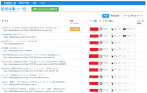
■ List of analysis results. Directories are displayed in the order of most accessed directories.
■ "Mouse movement" is displayed numerically.
You can check the order in which the actions were performed by checking the hover time of the mouse.
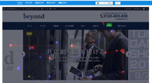
■ This is the location where you get the most clicks. The key visual part gets a lot of clicks.
There were fewer clicks after scrolling down.
■ ``Perusive reading area.'' This represents "time spent".
The key visual part of the top page is yellow, which
means that people spend a lot of time viewing this part.
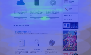
■ If you go to the middle of the page in the "Perusive reading area", the number of stays will decrease.
■ If you go to the bottom of the page in the "Performance Area",
you will see a section about our company's implementation examples, but I think many people will spend some time there.
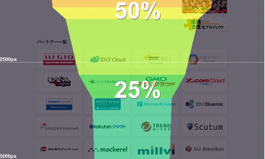
■This is the "end area" display. This shows how far the page has been read.
Of course, the further you go to the bottom of the page, the lower the numbers will be.
■"Exit area" indicates which display area the user exited from the page.
The red part will be the escape area.
summary
"User Heat" is updated and accumulated on a daily basis, so
mouse clicks and perusal areas change each time.
"User Heat" can
also
The analysis results are different from those on desktops , as mobile pages are more likely to be read from top to bottom
that heat map analysis can be used as a guide for reviewing the content UI and written information, and
can also lead to improved conversion rates.

![[Osaka/Yokohama/Tokushima] Looking for infrastructure/server side engineers!](https://beyondjapan.com/cms/wp-content/uploads/2022/12/recruit_blog_banner-768x344.jpg)
![[Deployed by over 500 companies] AWS construction, operation, maintenance, and monitoring services](https://beyondjapan.com/cms/wp-content/uploads/2021/03/AWS_構築・運用保守-768x344.png)
![[Successor to CentOS] AlmaLinux OS server construction/migration service](https://beyondjapan.com/cms/wp-content/uploads/2023/08/almalinux_blogbanner-768x344.png)
![[For WordPress only] Cloud server “Web Speed”](https://beyondjapan.com/cms/wp-content/uploads/2022/11/webspeed_blog_banner-768x344.png)
![[Cheap] Website security automatic diagnosis “Quick Scanner”](https://beyondjapan.com/cms/wp-content/uploads/2023/04/quick_eyecatch_blogbanner-768x345.jpg)
![[Reservation system development] EDISONE customization development service](https://beyondjapan.com/cms/wp-content/uploads/2023/06/edisone_blog_banner-768x345.jpg)
![[Registration of 100 URLs is 0 yen] Website monitoring service “Appmill”](https://beyondjapan.com/cms/wp-content/uploads/2021/03/Appmill_ブログバナー-768x344.png)
![[Compatible with over 200 countries] Global eSIM “Beyond SIM”](https://beyondjapan.com/cms/wp-content/uploads/2024/05/beyond_esim_blog_slider1-768x345.jpg)
![[If you are traveling, business trip, or stationed in China] Chinese SIM service “Choco SIM”](https://beyondjapan.com/cms/wp-content/uploads/2024/05/china-sim_blogbanner-768x345.jpg)
![[Global exclusive service] Beyond's MSP in North America and China](https://beyondjapan.com/cms/wp-content/uploads/2024/06/gloval_surport_blog_slider-768x345.jpg)
![[YouTube] Beyond official channel “Biyomaru Channel”](https://beyondjapan.com/cms/wp-content/uploads/2021/07/バナー1-768x339.jpg)
 0
0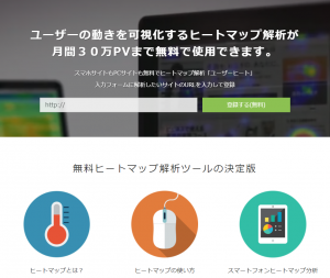




![[2025.6.30 Amazon Linux 2 support ended] Amazon Linux server migration solution](https://beyondjapan.com/cms/wp-content/uploads/2024/05/59b34db220409b6211b90ac6a7729303-1024x444.png)


