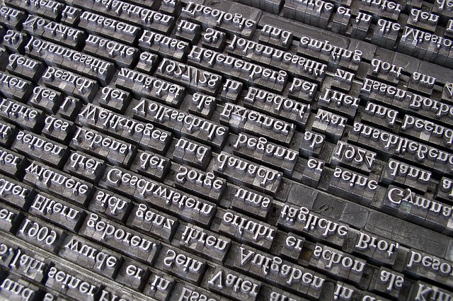
Japanese fonts (Gothic) that can be used on both CentOS and Windows!
Hello,
I'm Mandai, the Wild Team member of the development team.
What do you do when typing Japanese on Linux?
Many people use it for work, so they may not think much about it, but just changing the font can change your mood and, more importantly, how easy it is to read the text, so you want to use an easy-to-read font so you can write code and enter commands comfortably.
This time, we will introduce some high-quality Japanese fonts that are available for free and will help meet such needs, along with some trivia
Japanese fonts that can be installed with yum
You might be thinking, "Isn't yum just a software installer?", but it has a surprisingly wide range of uses, including this one.
It's easy, so let's quickly install it.
IPA font

Speaking of Japanese fonts for Linux, this one is the one
to go for. It's free and of high quality.
It's distributed by the Information-Technology Promotion Agency, Japan (IPA), so you can use it with confidence.
As long as the name IPA font is not used, it is allowed to be modified and redistributed, and there are many fonts derived from IPA fonts
For CentOS, you can install it using yum
sudo yum install ipa-gothic-fonts ipa-pgothic-fonts
This is the beginner's level
VL Gothic Font
A slightly less popular style is VL Gothic
To install VL Gothic on CentOS, use the following command:
sudo yum install vlgothic-fonts vlgothic-p-fonts
In my case, I like to use VL Gothic when writing source code, and I have both the code and the terminal set to VL Gothic
When you hear the name VL Gothic, you might be wondering, "What is that?" But if you trace it back to its origins, you'll see that it's based on the M+ font, with the missing parts created using parts of the M+ font, and the parts that were still missing being supplemented with characters based on the Sazanami font, making it a font that takes the best of both worlds
It's purely a matter of personal preference, but I don't really like the English characters in monoscope, and IPA fonts are not suitable for use in a terminal, so I prefer VL Gothic
By the way, M+ fonts themselves are still being added, and are updated once about 100 characters have been accumulated
Other useful Japanese fonts
The fonts up to this point can be easily installed using yum, but the fonts below require some manual installation in the terminal
Sazanami Font
efont Project Japanese Top Page - OSDN

Select and download
the latest version of the Sazanami font from the download file list Although it's the latest version, the last update was in 2004, so it's over 12 years old.
The origins of this font are quite interesting; it was developed as an alternative font after the Kofu font (oh, how nostalgic...) was discontinued.
of why distribution ended the announcement regarding the end of Tofu Font production activities , but it appears that it was an unfortunate font.
To install, extract the "sazanami-20040629.tar.bz2" downloaded from the URL above, create a suitable directory under /usr/share/fonts/ and put the file there
wget https://ja.osdn.net/dl/efont/sazanami-20040629.tar.bz2 tar jxf sazanami-20040629.tar.bz2 sudo mv sazanami-20040629 /usr/share/fonts/sazanami
This completes the font installation
By the way, eastern wind is pronounced "kochi."
If you pronounce it "tonpuu," you play mahjong too much, so please study.
Noto Sans CJK JP

*Three thickness levels from top to bottom: thin, regular, and black
This is a high-quality font that will make you gasp in amazement at how open source it is!
It's a font created by a collaboration between Google and Adobe, so it's a great font.
However, the size is...
When text is rendered by a computer, sometimes characters are displayed as “tofu”.
This sentence will surely grab the hearts of Japanese-speaking users.
Incidentally, the name Noto is apparently an abbreviation of "no more tofu," and it seems to convey a strong message that the square thing will no longer be displayed.
"Noto Sans Mono CJK JP" is slightly thicker, so if you don't like that, you can adjust the thickness of "Noto Sans CJK JP" to suit your preference
The installation method is as follows:
wget https://noto-website-2.storage.googleapis.com/pkgs/NotoSansCJKjp-hinted.zip unzip NotoSansCJKjp-hinted.zip sudo mkdir /usr/share/fonts/NotoSansCJKjp sudo mv NotoSans* /usr/share/fonts/NotoSansCJKjp/
The font files in the zip file have the extension "otf", but they can be used in the same way as ttf
As mentioned earlier, this font was jointly developed by Google and Adobe. Therefore, it is released separately, with Noto Sans being the version released by Google and Source Han Sans being the version released by Adobe.
While there are some differences, it seems safe to assume they are essentially the same thing.
Source Han Sans apparently refers to the Japanese part of the font family "Source Han Sans," which includes Source Han Sans, but that's confusing.
Why would they do this?
If you search, you will find many derivative fonts based on this font, but because the base font is so well-made, many of them seem to be quite playful
Takao Font

Some Linux distributions use the Takao font as the default Japanese font.
This is no surprise, as the Takao font is a derivative of the IPA font. Apparently, the Takao font
was created to allow for flexible maintenance of the IPA font, which has a gradual release cycle.
Incidentally, the name Takao comes from Takao Hayashi, the designer of the TB font, which the IPA font was based on.
Another bit of trivia: the TB font itself is a paid font, available for purchase in the TypeBank font family TB Gothic
The installation method is as follows
#URL is wget https://launchpad.net/takao-fonts/trunk/15.03/+download/TakaoFonts_00303.01.zip unzip TakaoFonts_00303.01.zip sudo mkdir /usr/share/fonts/TakaoFonts sudo mv TakaoFonts_00303.01/Takao* /usr/share/fonts/TakaoFonts/
There's more trivia than fonts now
That's all
 66
66 The person who wrote this article
About the author