The icon has changed! Visual Studio Code Version 1.17 released

table of contents
- 1 Why did the icon change?
- 2 Terminal behavior has changed
- 3 You can now jump to output lines from the debug console
- 4 Code Folding Improvements
- 5 Dynamically suggest import paths in JavaScript/TypeScript
- 6 IntelliSense now recognizes Markdown in JavaScript and TypeScript
- 7 Markdown code blocks now recognize and process programming languages
- 8 Multi-root workspaces are now implemented! (Preview only...!)
- 9 summary
Hello,
I'm Mandai, the Wild Team member of the development team.
A while ago, Visual Studio Code (hereinafter referred to as VSCode) was updated
With this latest update, the icons have changed from blue to orange, which still feels a bit strange, but I'd like to take a look at the new features and improvements in this update
Why did the icon change?
At first glance, the biggest change is probably the icon,
but it's not just VSCode that has changed; it seems the entire Visual Studio product line has undergone changes.
The details of the change and the underlying thinking here , so it's interesting to read, but basically it seems that the color of VSCode was changed because the logos for VSCode and Visual Studio Team Services were the same color.
I liked the previous logo better, so I'm disappointed. There's also a
lot of controversy on GitHub, so it's unclear whether they'll go back to the original, or continue as they are. It's a situation we'll need to keep an eye on.
Vscode New logo
New VS Code icon is ugly!
Everyone seems to be passionate about VSCode, and it's becoming a great product
Terminal behavior has changed
Due to the nature of my work, I often use the terminal, and the behavior of the VSCode terminal has changed
In one word, it's good!
And it's di molto.
I looked at the release notes and it was indeed mentioned.
It seems that it's not just an improvement, but rather a complete overhaul of the rendering engine, and the execution speed seems to have improved significantly.
The release notes also include a gif of the ls command being run in a directory with many files, but this depends on the machine specs, so even if I were shown a screenshot, I feel like...
However, improvements have been made and it now runs smoothly
What I'm most happy about is that in previous versions, if you were looking at a log in progress, the terminal would scroll, making it difficult to calmly check the log. Now, the terminal only scrolls when the latest log is displayed
I was relieved from the daily grind of searching for the data I wanted while crying through the waterfall of logs, thinking, "Please turn off the debug messages before committing (although I often do that too /(^o^)\)"!
Also, I noticed that the font in the terminal had changed, but it turns out to be a bug that has been fixed in 1.17.2
You can now jump to output lines from the debug console
This is good.
Di molto bene.
You can just leave it as it is with console.log as you like... that's fine, but there's no longer any need to add an identifying string to each log that was console.logged, or count the number of lines in the log to calculate the output position
I'm referring to the debug console, not the terminal, so please excuse me.
The terminal has a function that displays an error and jumps to the relevant part.
I think both are very easy to use and great features
Code Folding Improvements
When working with long source code, you can use code folding (a feature that shows/hides code using the +/- icons near the line numbers on the left side of the editor) to display only the parts you need, but this feature has now become even more powerful
If you want to go beyond the code folding and fold into a larger region, you can now specify this in the comments using the region keyword
Currently, VSCode supports eight languages: TypeScript/JavaScript, C#, C/C++, F#, Powershell, and VB. Each language has a slightly different syntax.
This is due to differences in the format of each language, and is not specified by VSCode itself.
Below are the methods for specifying regions that can be used in each language
- TypeScript/JavaScript: //#region, //#endregion, //region, //endregion
- C# : #region, #endregion
- C/C++: #pragma region, #pragma endregion
- F# : //#region, //#endregion
- Powershell: #region, #endregion
- VB: #Region, #EndRegion
I'm ashamed to say that I didn't know about this feature, and I didn't feel like using it.
The reason is that I thought it would be pointless to have words that are unrelated to the operation appear in the code (even more so than commenting out the previous code), but looking at Stackoverflow, there are people who strongly dislike it, and it seems to be quite controversial.
It seems that VSCode should support features that exist as specifications, regardless of likes and dislikes
Dynamically suggest import paths in JavaScript/TypeScript
I've never built such a large system using JS/TS, so I didn't really understand it, but it wasn't something I'd ever done before.
It's useful when you have to dig into paths using imports!
IntelliSense now recognizes Markdown in JavaScript and TypeScript
I was wondering what that meant, but it turns out it means that you can now write comments for each method in IntelliSense in Markdown.
You can even write comments for your own functions in Markdown, so it's a great option if you want to write comments that are easy to understand.
/** * This is my function * - Comment like this * - Comment like that */ function OrenoFunc(){ // Do some processing }
If you write it like this, it will be recognized by IntelliSense
Markdown code blocks now recognize and process programming languages
I see..
````js let test = 0; ```` ``css a { margin: auto;} ```` ````html <a href="beyodjapan.com">beyond</a> ````
For example, if you have the following code, press "Ctrl + /" within each code block
The result will be as follows
````js // let test = 0; ```` ````css /* a { margin: auto;} */ ```` ````html <!-- <a href="beyodjapan.com">beyond</a> --> ```
When copying code into Markdown, I usually create it separately and check that it works before copying it, so I don't see much benefit to it, but it seems like they've added some small features like this
The addition of these small features means that the full range of functionality is now available, which can be seen as a positive trend
Multi-root workspaces are now implemented! (Preview only...!)
One feature that is of great interest in future upgrades is the multi-root workspace, which allows you to set multiple document roots, and it has already been released in the preview version
Multi-root workspace is a feature that allows you to set multiple document roots for a workspace.
Until now, the concept was that the document root = workspace, but this seems to expand the scope of workspaces.
I only use the Windows version, so I haven't tested it on other environments, but it can be installed alongside the regular release version, so feel free to give it a try!
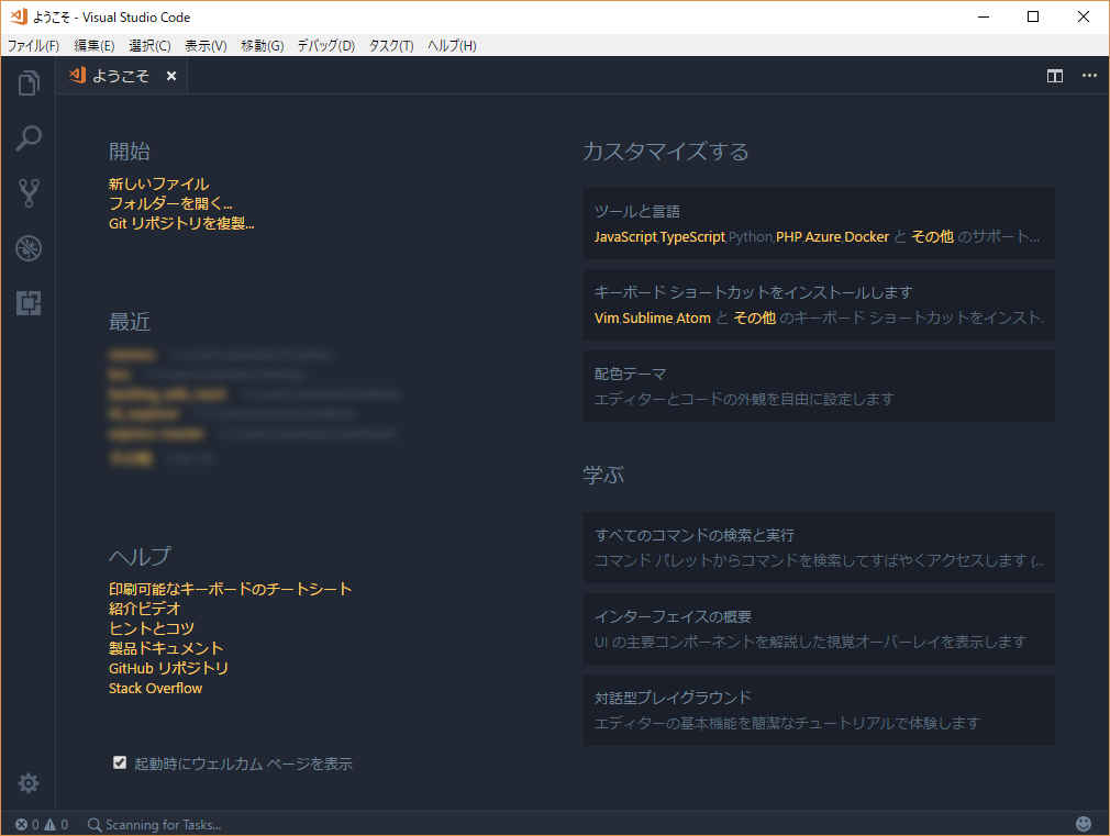
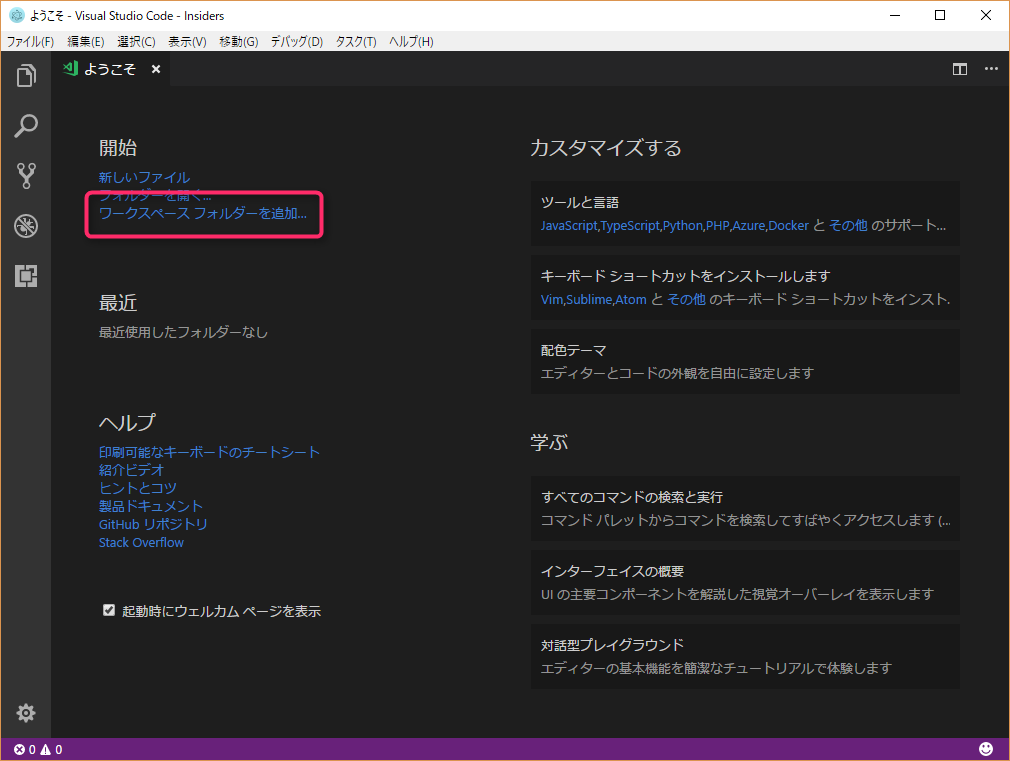
Let's compare the startup screens of the regular version and the preview version


In the preview version, the features have been added in the boxed areas (but the git repository cloning command has disappeared)
It's easy to use and intuitive.
Previously, you had to open two windows, for example, if you had separate workspaces for source code and documentation, but now you can work smoothly in a single window.
However, having two windows has the advantage that it is easier to use on multiple displays (partly because we've been used to that style up until now), so in that case, you may still have the option of opening two windows as before
summary
This update includes major changes to the appearance and content, such as changes to the icons and the terminal engine.
I was particularly impressed by the significant improvements in behavior that were made with the changes to the terminal engine, so I highly recommend you try it out! (Although there's no benefit to advertising it.)
That's all

 0
0


